The Evolution of “Sticks”

Sticks

In my last blog post, I mentioned a workshop I took in March from Nancy Crow titled “Lines, Curves, Shapes, Figure Ground.” I noted problems with my design made up of curved shapes and lines.

I came home slightly frustrated, but I didn’t give up! I sketched out some new ideas, including some with straight lines because I thought the curves were restricting the purpose of the exercise. I started with a straight-line design based on my original curved one, but it didn’t work.

So I decided to start anew and came up with a design I like. It reminds me of “The Portland Panels” Klaus Moje did for the 2008 exhibition at the Portland Art Museum in fused glass, another example of the influence glass art has on my work.

I put the design on my studio wall using black strips on a white background – 2 feet by 2¼ feet – but it was not as exciting as I had hoped. I changed the orientation, turned it upside down, moved some strips. It was better, but still not ideal.

Then I made a larger version, thinking the size was restricting me. I cut wider strips, which worked better. The black crossings of the diagonal strips made some interesting new triangular shapes.

Sticks - Initial Design

I sewed it together – black and white, piece by piece, trying to make it as close to the pinned-up design as possible. There were some obvious errors. One black line didn’t continue straight through a small white triangle; another black line didn’t match up at the crossings. Although I’d intended the lines to be relatively straight (I don’t use a ruler), some were obviously curved.

Sticks - Initial Design - Sewn

Because the high contrast of black on white did not meet one of the requirements of our figure ground exercise – i.e. to bring tertiary lines into the design – I layered some cream-colored strips on top to create new configurations. It looked even more like Moje’s “Portland Panels.”

Sticks - Design with Tertiary Lines

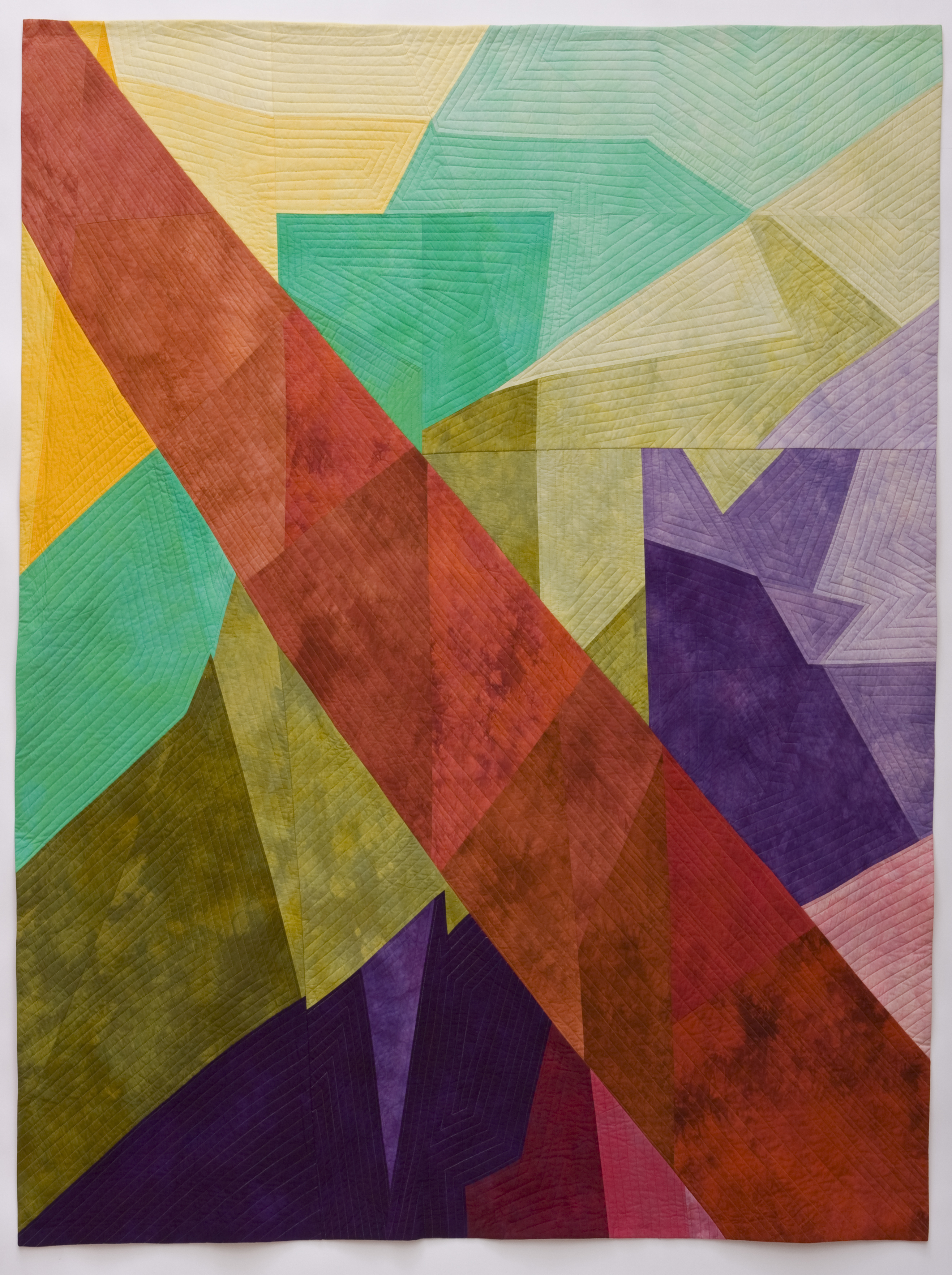
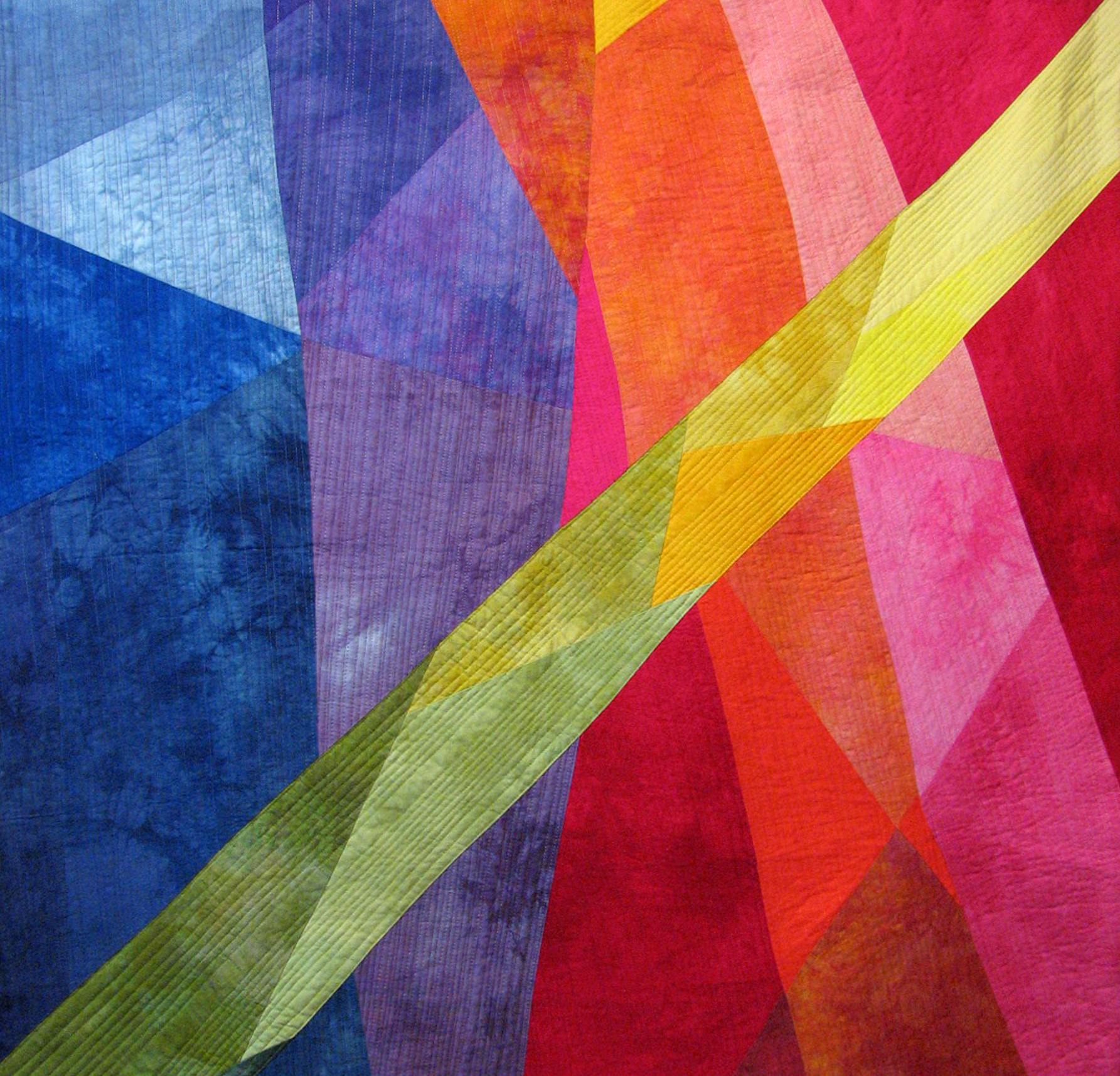
I then interpreted it in color using a pattern-dyed piece of fabric for the background and solid-colored strips on top in complementary colors. At first my strips were too close to the same value, so I made them lighter for the “black” lines and of similar value for the tertiary lines. Then I sewed it together piece by piece, tediously matching intersections as closely as possible. It wasn’t easy, because I didn’t have any extra background fabric. The whole piece came out quite skewed. It was also quite structured – but I pushed on.

Sticks - #1

I pieced the design again used another pattern-dyed piece for the background. I cut the strips more freely and inserted them into the length (or width) of the background, cutting through previously sewn strips to make the intersections. It was easier to construct, and, amazingly, the strips matched up even better than doing it piece by piece. I also eliminated some strips so that I didn’t break up the patterned background. This was much more fun!

Sticks - #2

Now I’m thinking of other variations – strips appliquéd on top; strips made up of smaller, collaged pieces or strip pieced like Moje’s work; no strips and slashing and sewing the background together instead; moving color across the piece; making a piece out of only the strips with no background. It’s beginning to look like a series!

So a couple of nights ago, I dreamed about the series and came up with a title: “Sticks.” Possibilities and images are filling my head – Pick-Up Sticks; FiddleSticks; Sticks and Stones; A Sticky Situation; Stick Around; Pile of Sticks; A Stick-ler for … ; Stick Up; Stick to Me Like Glue; Stick It to ‘Em; Broken Sticks; Stick Figures; Walking Sticks; DrumSticks; ChopSticks – to name a few.

I’ll keep you updated on the “Stick” series in future blog posts. In the meantime, keep dreaming and designing – and having fun!

Red Sky at Morning

Nonseries Work

I recently returned from two adventures. Last month, my husband Rich and I, plus our older daughter Julie and her boyfriend George, spent nine lazy days in Hawaii on touristy Maui and delightfully laid back Molokai. The trip was pure leisure, and I had no plans to do any work. However, I found the tropical landscape – waving palm trees; mesmerizing ocean, with its breaching whales and curious sea turtles; and glittering beaches inspired me.

During my second adventure – a five-day workshop taught by Nancy Crow in Indianola, not far from Bremerton, WA – it was coincidental that my “off-the-top-of-my-head” design featured palm frond-like shapes and a circle, perhaps representing the sun. However, the work was not as successful as I hoped.

Whenever I’m in a class, I consider the works I produce to be studies, not masterpieces. But this time I had not “done my homework”: I hadn’t brought the range of fabrics – in this case, neutrals – necessary to open up my creativity. I also hadn’t sketched possible designs, so I came to the class with limited ideas. Consequently, I floundered and did not do my best work.

What I did do was add to my knowledge of figure ground, which was the focus of the class. Figure ground is our ability to see parts of a visual field as well-defined objects standing out against a less distinct background. The figure comes forward; the ground stays behind. I need not only to be more aware of figure ground in my own work but also to recognize it in the work of artists in other media. I also learned that it’s okay to fail – as long as I don’t do it too often.

I’ve studied with Nancy Crow since 1993 and in over 22 workshops, and she always inspires me and gives me the “shove” I need. I returned from this class with some goals: do more “sketches” in black, gray and white fabrics; translate the best of these sketches into actual quilts emphasizing figure ground; and return with five completed quilt tops, which is her assignment for next year’s workshop.

In the meantime, the Color Improvisations exhibit – which includes my two quilts, “Seeing the Light” and “Out on a Limb” – has completed a successful, but short, visit to Verona, Italy. I learned from Nancy Crow that Verona was added to the tour after the president of the Aurifil Threads Company saw the show in Stuttgart and arranged for its venue in his hometown.

I also have three quilts – “Healing I,” “Let There Be Light” and “The Waters of Heaven” – on their way to Brazil for exhibitions in Rio de Janeiro and Sao Paulo in June and early July. I’ll post details and a link to these exhibitions’ website later. “Sorok” and “Sorok dva” are on exhibit at the Lynnwood Convention Center in Lynnwood, WA, through July 31.

More locally, I will have three quilts – “Let the Sunshine In,” “Autumn Leaves” and “Green,” a three-dimensional vessel – in the Battle Ground Art Alliance exhibit in my hometown this weekend, March 19 and 20. I’ve also donated a quilt – “Red Sky at Morning – Sailor’s Warning” – for the raffle in conjunction with this show. The raffle proceeds go toward participation by the group in local art festivals, the purchase of art books for the Battle Ground Public Library, scholarships for students interested in the arts, and other projects of the nonprofit group. Tickets will be available during the show, so be sure to pick some up if you attend.

Now, back to work on those goals!

Red Sky at Morning – Sailors Warning

“Red Sky at Morning – Sailor’s Warning”
©2006 Melisse Laing
13″w x 12″h
Donated to Battle Ground Art Alliance raffle

Color Improvisations Goes to Verona, Italy

Color Improvisations

Verona, Italy, has been added to the exhibition schedule for Color Improvisations. My two quilts created for the show, “Seeing the Light” and “Out on a Limb,” will be among those at the Museum of Fine Art in Verona’s Palazzo Forti, 3/8-13/11.

Not only is this a huge opportunity for the exhibition, adding yet another country to the show’s tour, but it’s an amazing location to show contemporary art quilts. Palazzo Forti is Verona’s modern art gallery, but the building itself is anything but modern. Constructed in the 13th century on what was a Roman site, the first attempt to convert it to a museum was thwarted by the Austrian occupation. After the war, the building spent a few months as a museum, only to be closed again until the 1980s. It finally found its place in the art world in 1982. Since then, it has held exhibitions dedicated to Italian artists, the Impressionists and the Expressionists and has built a permanent collection that includes the works of Italian notables such as Fattori, Guidi and Dall’Oca Bianca.

You can read more about the history of this building by following the link on the Color Improvisations website. And you can read more about – and see more photos of – the show on the Color Improvisations page on my blog.

Seeing the Light

“Seeing the Light”
©2009 Melisse Laing
77”w x 74”h
$7,450.00