Color Improvisations Exhibit Continues Its Journey

Color Improvisations

My quilts “Seeing the Light” and “Out on a Limb” were in the second German venue of Color Improvisations, which closed Sunday, June 12, in the city of Karlsruhe. The show was on the second floor of the Regierungspräsidium Karlsruhe, within a minute’s walk of the central market square. Color Improvisations appeared concurrently with another exhibit, Quilts from Sweden to Israel.

Uta Lenk, another artist in Color Improvisations, said the May opening in Karlsruhe was attended by a number of people. The audience was reportedly quite impressed by knowledgeable remarks on quilting by the museum director, Werner Lerch. In addition, the audience was treated to a lecture titled “Women and Creativity” by Dr. Annette Bernards, and Susanne Rosea performed a couple of songs on a golden lyre. As we learned in Stuttgart, these Europeans know how to put on a wonderful opening!

Thomas Curtze, who produced the Color Improvisations catalog and the pictures from the opening in Stuttgart, also took pictures in Karlsruhe.
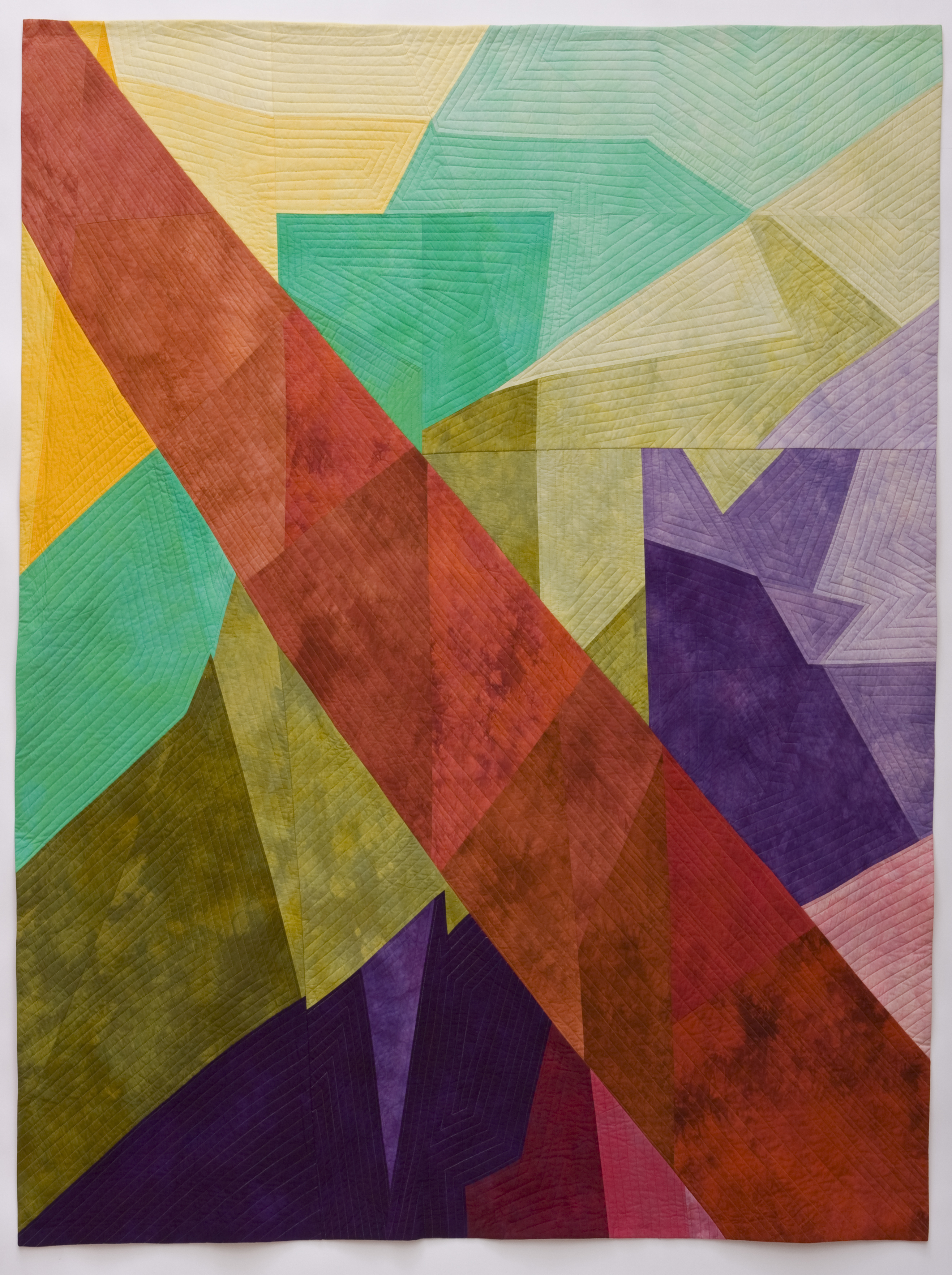
“Seeing the Light” can be seen on the right side of the 7th photo.

Beata Keller-Kerchner, an artist from Switzerland who also has work in Color Improvisations, made two short videos of the exhibition. In her “short walk around,” you see not only the quilts but also the beautiful space in which they hung.

The videos are on YouTube, part 1 and part 2.

Winding up this post, I must brag about another success for “Seeing the Light,” one of my two quilts in this exhibition.  It has been accepted for Sandra Sider’s new book The Studio Quilt, No. 6: State of the Art. The book will contain works by sixty artists. As a further brag, “Seeing the Light” will be on the front of the volume. The book is set for release in November and will be available on amazon.com The first two volumes in The Studio Quilt series, featuring artists Ludmila Aristova and Jeannette Meyer, are now available on Amazon.

The Evolution of “Sticks”

Sticks

In my last blog post, I mentioned a workshop I took in March from Nancy Crow titled “Lines, Curves, Shapes, Figure Ground.” I noted problems with my design made up of curved shapes and lines.

I came home slightly frustrated, but I didn’t give up! I sketched out some new ideas, including some with straight lines because I thought the curves were restricting the purpose of the exercise. I started with a straight-line design based on my original curved one, but it didn’t work.

So I decided to start anew and came up with a design I like. It reminds me of “The Portland Panels” Klaus Moje did for the 2008 exhibition at the Portland Art Museum in fused glass, another example of the influence glass art has on my work.

I put the design on my studio wall using black strips on a white background – 2 feet by 2¼ feet – but it was not as exciting as I had hoped. I changed the orientation, turned it upside down, moved some strips. It was better, but still not ideal.

Then I made a larger version, thinking the size was restricting me. I cut wider strips, which worked better. The black crossings of the diagonal strips made some interesting new triangular shapes.

Sticks - Initial Design

I sewed it together – black and white, piece by piece, trying to make it as close to the pinned-up design as possible. There were some obvious errors. One black line didn’t continue straight through a small white triangle; another black line didn’t match up at the crossings. Although I’d intended the lines to be relatively straight (I don’t use a ruler), some were obviously curved.

Sticks - Initial Design - Sewn

Because the high contrast of black on white did not meet one of the requirements of our figure ground exercise – i.e. to bring tertiary lines into the design – I layered some cream-colored strips on top to create new configurations. It looked even more like Moje’s “Portland Panels.”

Sticks - Design with Tertiary Lines

I then interpreted it in color using a pattern-dyed piece of fabric for the background and solid-colored strips on top in complementary colors. At first my strips were too close to the same value, so I made them lighter for the “black” lines and of similar value for the tertiary lines. Then I sewed it together piece by piece, tediously matching intersections as closely as possible. It wasn’t easy, because I didn’t have any extra background fabric. The whole piece came out quite skewed. It was also quite structured – but I pushed on.

Sticks - #1

I pieced the design again used another pattern-dyed piece for the background. I cut the strips more freely and inserted them into the length (or width) of the background, cutting through previously sewn strips to make the intersections. It was easier to construct, and, amazingly, the strips matched up even better than doing it piece by piece. I also eliminated some strips so that I didn’t break up the patterned background. This was much more fun!

Sticks - #2

Now I’m thinking of other variations – strips appliquéd on top; strips made up of smaller, collaged pieces or strip pieced like Moje’s work; no strips and slashing and sewing the background together instead; moving color across the piece; making a piece out of only the strips with no background. It’s beginning to look like a series!

So a couple of nights ago, I dreamed about the series and came up with a title: “Sticks.” Possibilities and images are filling my head – Pick-Up Sticks; FiddleSticks; Sticks and Stones; A Sticky Situation; Stick Around; Pile of Sticks; A Stick-ler for … ; Stick Up; Stick to Me Like Glue; Stick It to ‘Em; Broken Sticks; Stick Figures; Walking Sticks; DrumSticks; ChopSticks – to name a few.

I’ll keep you updated on the “Stick” series in future blog posts. In the meantime, keep dreaming and designing – and having fun!

Color Improvisations Goes to Verona, Italy

Color Improvisations

Verona, Italy, has been added to the exhibition schedule for Color Improvisations. My two quilts created for the show, “Seeing the Light” and “Out on a Limb,” will be among those at the Museum of Fine Art in Verona’s Palazzo Forti, 3/8-13/11.

Not only is this a huge opportunity for the exhibition, adding yet another country to the show’s tour, but it’s an amazing location to show contemporary art quilts. Palazzo Forti is Verona’s modern art gallery, but the building itself is anything but modern. Constructed in the 13th century on what was a Roman site, the first attempt to convert it to a museum was thwarted by the Austrian occupation. After the war, the building spent a few months as a museum, only to be closed again until the 1980s. It finally found its place in the art world in 1982. Since then, it has held exhibitions dedicated to Italian artists, the Impressionists and the Expressionists and has built a permanent collection that includes the works of Italian notables such as Fattori, Guidi and Dall’Oca Bianca.

You can read more about the history of this building by following the link on the Color Improvisations website. And you can read more about – and see more photos of – the show on the Color Improvisations page on my blog.

Seeing the Light

“Seeing the Light”
©2009 Melisse Laing
77”w x 74”h
$7,450.00